THE INTRANET AND ITS EVOLUTION
First of all let’s clarify what an Intranet is, and how the meaning of the term has changed over time.
In Computer Science Intranet means a private corporate network for exclusive internal use (often completely isolated from the outer Internet) that allows you to share information and files between employees.
Initially, the Intranet had a simple role, a sort of archive of company data and useful information located in a single central portal.
The concept of collaboration, in this regard, is quite recent: the advent of social networks and the massive diffusion of smartphones have dramatically transformed our private life and, inevitably, professional one as well, leading to new ways to interact with people and information.
The term Intranet has thus assumed a different and broader form: no longer just a static website where you take a look at corporate documents, but a channel of communication and collaboration that combines the best features to help employees carry out their work, with the result of impacting in a positive way on their own organization and on working efficiency.
THE 5 PURPOSES OF THE INTRANET
According to James Robertson, one of the leading experts in the world on the subject and author of several books, the Intranet should have these 5 purposes:

Content and communication are the basic principles of a centralized ambient where you can gather all the information and make available an efficient communication channel.
The Intranet can be an environment to implement some activities that might be useful to all colleagues or to the entire organization to manage, for instance, the administrative part or business processes.
It is also important to introduce the right tools to enable mutual collaboration and support new and more innovative ways of managing work, remotely wise too.
Finally, the last principle concerns culture: the Intranet can be a vehicle for increasing awareness and corporate culture.
All these points together help us to define the most appropriate strategy to develop an ad hoc Intranet.
WE GET A FACELIFT ON OUR INTRANET: UX AT WORK!
Interlogica has already had its own Intranet for a long time, born from the work of willing developers. This web space guarantees fast access to the main tools (in our case Confluence and Jira), monitor the daily attendance recorded through personal key cards, access a heading of all the company’s contacts, and so on.
But time runs fast, the company grows and its needs change.
So the time has come for us to take matters into our own hands and turn our “Old lady” over!
We’re going to roll up our sleeves and open the UX Toolbox to extract the useful tools.
To ensure the Intranet to be truly functional, the most important factors are:
- Simplicity and speed in accessing information
- Flexibility to suit your work needs
- Cooperation with your team
- Involvement towards corporate culture
But what are the primary needs of our colleagues?
Fortunately, we have our catchment area to gather more detailed information about real needs and necessities and identify the optimum solutions accordingly.
In the light of the above, the choice to administer the instrument of the interview seems to be just right for us.
USER EXPERIENCE – THE QUESTIONNAIRE INTERVIEW
In this particular situation, the interview with a questionnaire allows to collect quickly quantitative data and, when well-drafted, qualitative as well.
How to structure it then?
First consideration: a product already exists.
Second consideration: it is widely used.
You must then carefully analyze the current system and produce a list of the existing features so that you can have a clear picture of the state of fact.
Next step is to figure out which of these features are actually used, in order to eliminate the dry branches, or the other way around, and work more on the tools that have greater potential.
This is how the first part of the questionnaire takes the form of a survey to see the actual use of the intranet tools, also based on the various corporate roles, and what frequency of use these tools have.
The second part of the questionnaire, however, is bound to investigate what new features can be usefully added.
The ideas and needs emerged over the last few months they are many actually; however, for a UX designer they all remain hypotheses until they are validated with more data, in order to understand if it actually makes sense to develop them or not, and with what priority.
To properly carry out these interviews, you need to keep in mind that the first rule to understand what users want is: never ask users what they want. The second rule to understand what users want is: never ask users what they want.

Image from “Fight Club” by David Fincher @FoxMovies
In short, the real goal is not to get the user to tell what they want, but to understand what they need.
For this reason, in interviews, you must absolutely avoid direct questions and understand how the user perform their daily work – and consequently identify how the Intranet could facilitate it, and what are the best tools to do that.
So we discover that external services need to be attained with greater immediacy, that the day is always full of commitments and an integration of its timetable would facilitate the clogged agenda of meetings and activities to be carried out; it is important to monitor attendance, but even more useful to include an overview on holidays, permits, etc.
A BROADER VIEW
As the good James Robertson tells us, the vision must be even more extensive: why not elevate our Intranet through conveying information on the company’s performance by increasing awareness and sharing with all employees?
We think of a section dedicated to Proof of Concept (PoC), to provide a demonstration of external and internal projects of Interlogica.
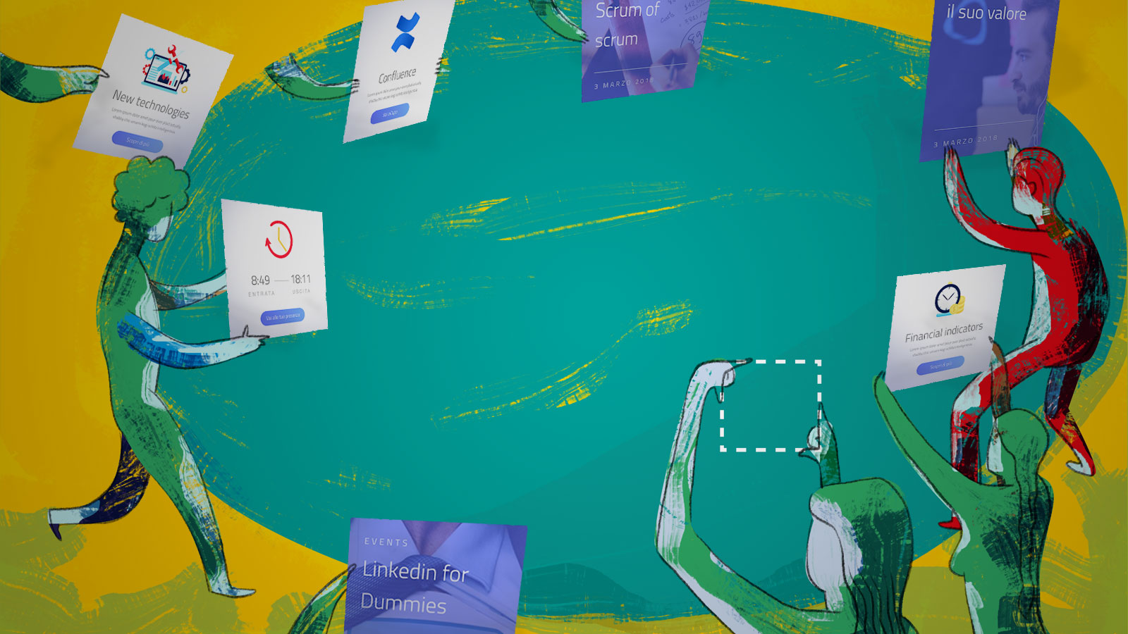
One result after another, with the information gathered we begin to elaborate useful new pieces to compose this twisty jigsaw called Intranet.
Another important point is to share financial indicators related to the company, both in relation to the revenue of the projects in place, and of the expenses incurred, in such a way as to make the economic aspect of the business more transparent towards the people and increase their awareness of the real trend of the company.
The possibility to read the news and the information inside the company is another parameter that emerges as important, and to best convey all that, you start to evaluate the integration with the blog of Interlogica and, if possible, on Workplace (the cooperation platform dedicated to the Enterprise world).
With the increase of people it becomes essential to easily find some “useful information”, and here is born the idea of a section called “People” containing not only a complete list of employees and their contacts, but also a general picture of roles division within the company, composition and interaction between the different teams.
For its part, every single employee can access the Intranet to view a general picture of their attendance, as already happened in the standard version, but now they can have a detailed overview of their holidays, sick days and permit hours, of the projects in which they are involved, etc.
Last but not least, the possibility of being able to keep under control the amount of training budget with a list of items of use: books, courses, lectures and all that can be useful to increase professional knowledge.

THE USER INTERFACE: WITH ITS OWN IDENTITY INTRALOGICA IS BORN
At this point, our Intranet has taken on a clear view and a defined flow of functionality, albeit in continual change, as well as the business needs.
Why not giving a definite identity to this project?
Naming is the first aspect to be taken into consideration. Alakazam! INTRALOGICA is born, a simple and immediate name, given birth by the union of the term Intranet with Interlogica.
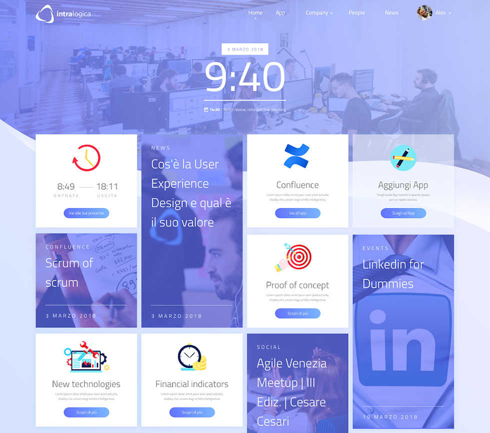
For the logo – a spin-off of the company’s official – we have modified the part of the name (from Interlogica to Intralogica) and apply new colours in the figurative part. In addition to the “Intra” preposition, we have given more relevance with bold reinforcement.

The color’s palette changes compared to the institutional one of Interlogica, without deviating too much though, turning towards a blue/violet, which well represents a feeling of ambition and creativity.
After having carried out an accurate study of the trends, all the ingredients needed are added to the recipe, in order to define the User Interface: gradients, shadows, rounded corners, sinuous waves to give movement and dynamism, just as a self-respecting Intranet should be.

A CONSTANTLY EVOLVING PATH
Following the study of the User Experience and the definition of the User Interface, we are carrying on the real development of our Intralogica – a gradual release of the prioritized functionalities based on their importance and the needed effort in terms of implementation.
Certainly, an ambitious and articulated project, the progress of which is constantly being updated, and that will still require some time, one piece after another.
Getting to the end of the article we just want to ask what is and what should be the Intranet?
The Intranet is a significant “piece” of the corporate “digital jigsaw puzzle”, a valuable management tool to help employees in their work, create collaboration and increase corporate awareness.
And I hope that it will become all of this for my colleagues and that it helps to make their working day in the office easier and more enjoyable.


